From Transactional Skincare to a Daily Ritual
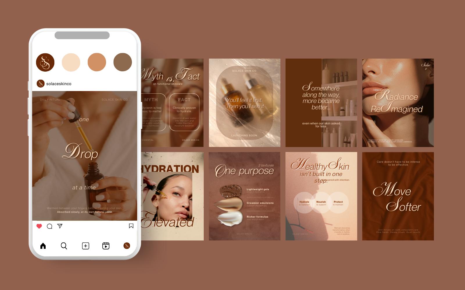
Cohesive Social Grid
Dynamic Brand Ecosystem
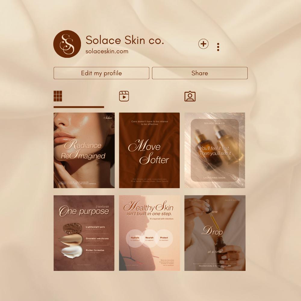
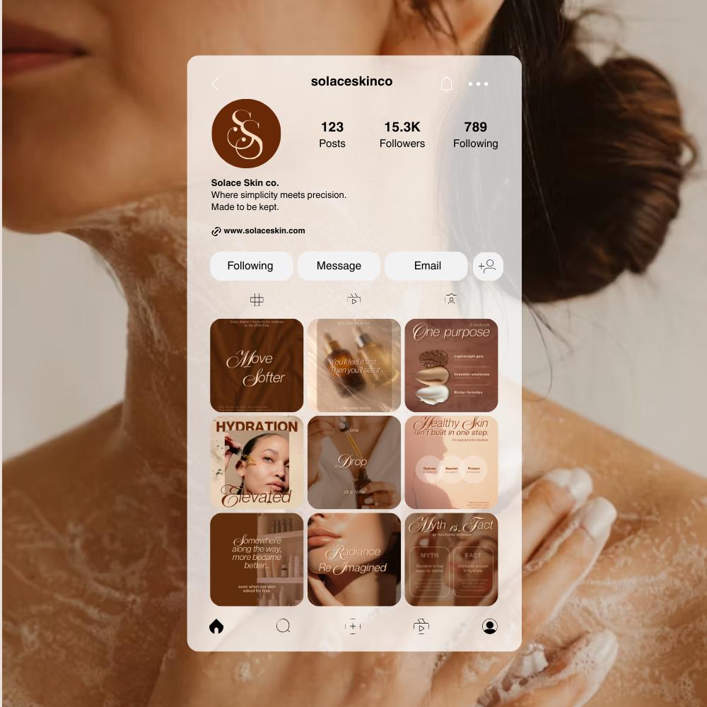
Profile Interface Design
Lifestyle Content Integration

Solace Skin Co. arrived with thoughtfully formulated products, but their Instagram presence felt clinical and interchangeable with dozens of other skincare labels. Their feed relied heavily on harsh whites, cool pastels, and generic product cut-outs.
The result? The brand felt cold, transactional, and discount-driven.
They wanted to position themselves as a premium, experience-led skincare brand, but their digital presence communicated “mass-market.” The disconnect was clear: They were selling comfort, but their feed felt clinical.
To fix the disconnect, we dug into the psychographics of the audience. These users aren't chasing viral trends; they are overstimulated, tired, and craving softness.
We shifted the visual language away from “Clinical Performance” toward “Sensory Ritual.” The feed had to feel like a deep breath—not an ad.
We centered the digital identity around one concept: Radiance as Ritual. Content shifted from "Fix your skin" to "Return to yourself."
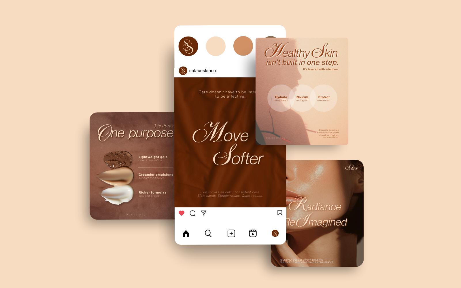
Sterile whites were replaced with terracotta, cocoa, and soft amber. These tones create emotional warmth while maintaining a premium feel. We paired elegant serif headlines with clean sans-serif body text to ensure editorial sophistication without sacrificing readability on mobile.
Rather than random posts, we built repeatable content pillars including Ritual Education, Ingredient Stories, and Affirmation-Led headlines.
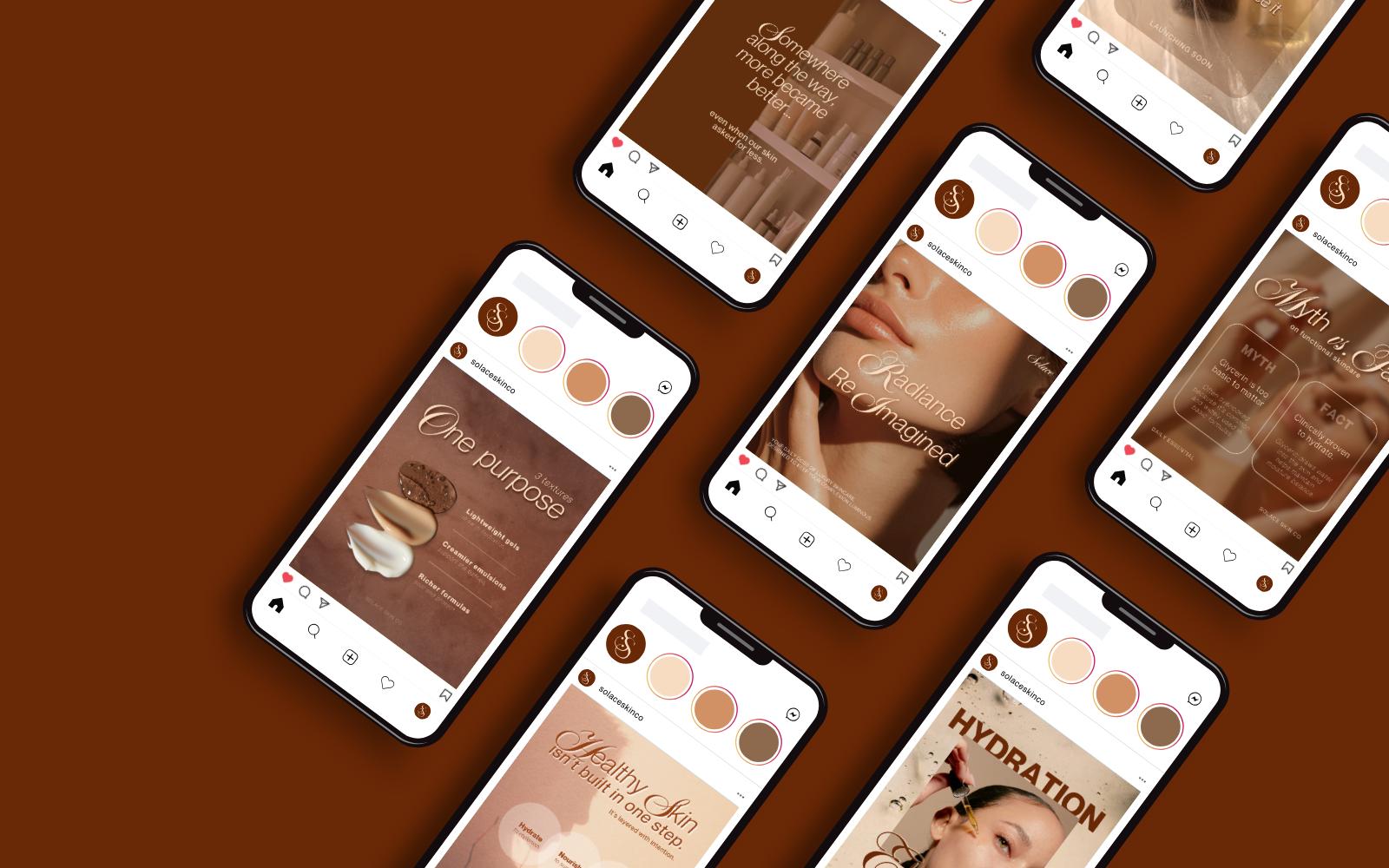
The true test of the new identity was how it performed "in the wild." We designed a cohesive ecosystem where every post type—from event invites to product launches—felt unmistakably Solace.
We rejected the “Minimal Clinical” route in favor of “Romantic Editorial.” This meant warm shadows, tactile close-ups, and poetic headlines.
Even temporary content like event announcements needed to feel premium. We utilized dark, moody photography to suggest an exclusive, intimate atmosphere.
For major product dates, the visuals needed to stop the scroll. We utilized high-contrast imagery with bold, oversized typography to announce launches with authority.
When selling specific items, we avoided the “floating bottle on white background.” Instead, products are integrated into the environment, emphasizing hydration and elevation.
Solace Skin Co. shifted from selling skincare products to offering a self-care philosophy. Their Instagram evolved from promotion-led to experience-led. The visual identity became part of the product experience itself—increasing perceived value, emotional trust, and audience resonance.
They didn’t just redesign our feed — they gave us language for what we were trying to make people feel. Our audience now talks about our products like rituals, not items.
We use cookies to improve your experience on our site. By using our site, you consent to cookies.
Manage your cookie preferences below:
Essential cookies enable basic functions and are necessary for the proper function of the website.
These cookies are needed for adding comments on this website.
Statistics cookies collect information anonymously. This information helps us understand how visitors use our website.
Google Analytics is a powerful tool that tracks and analyzes website traffic for informed marketing decisions.
Service URL: policies.google.com (opens in a new window)
You can find more information in our Cookie Policy and Privacy Policy.