From Information to Intimacy
Calming Social Stories
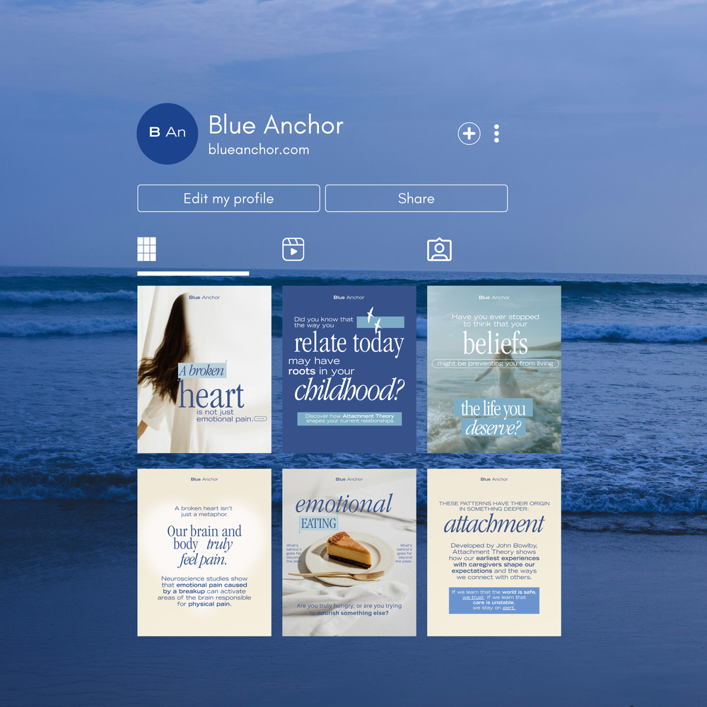
Optimized Profile Layout
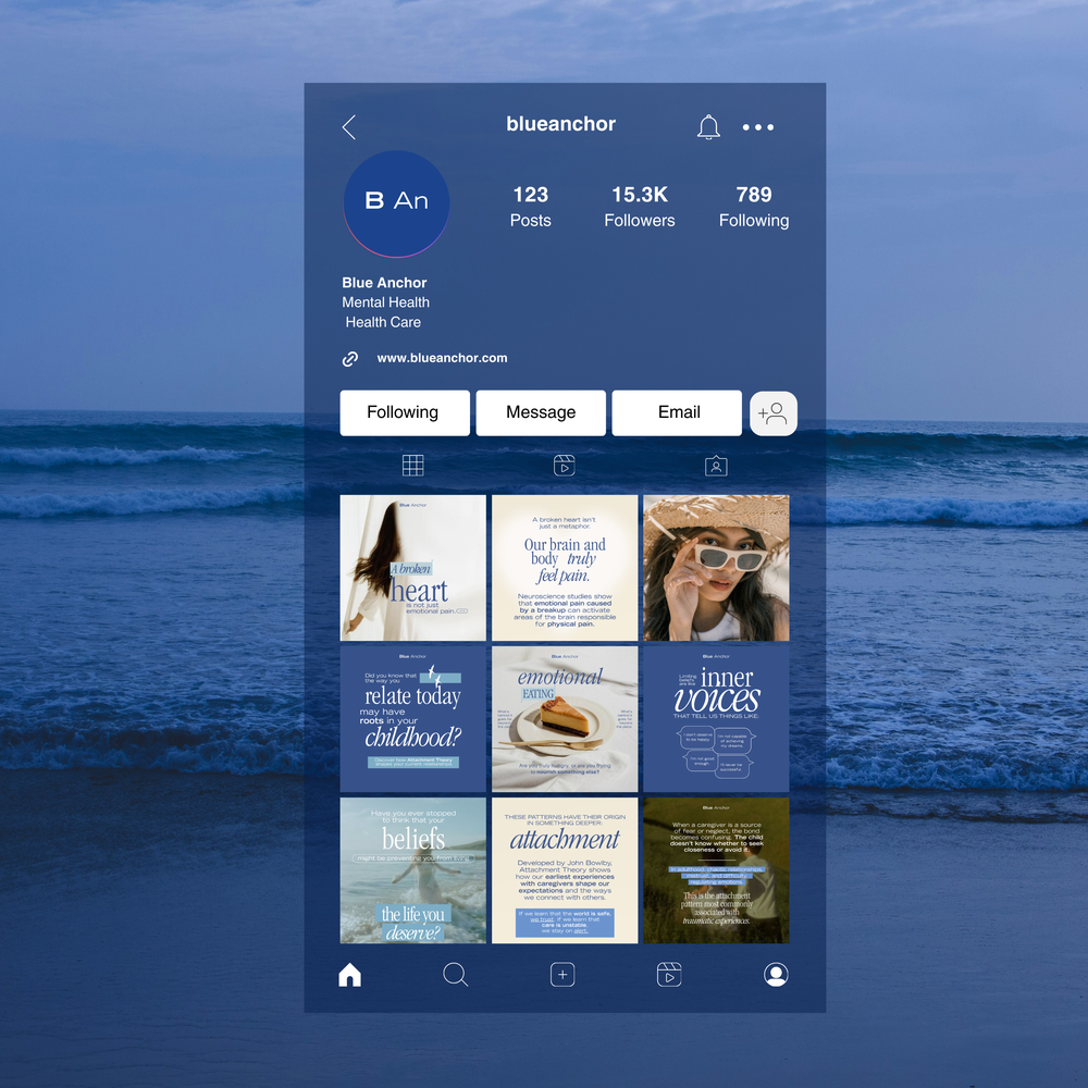
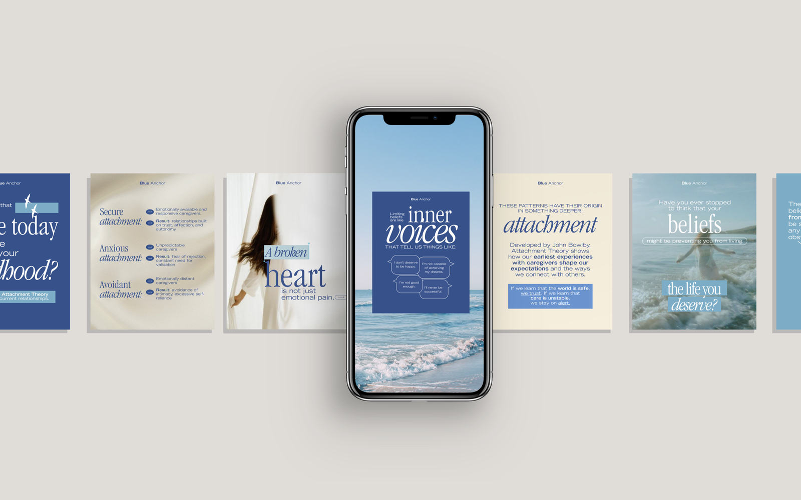
The interface
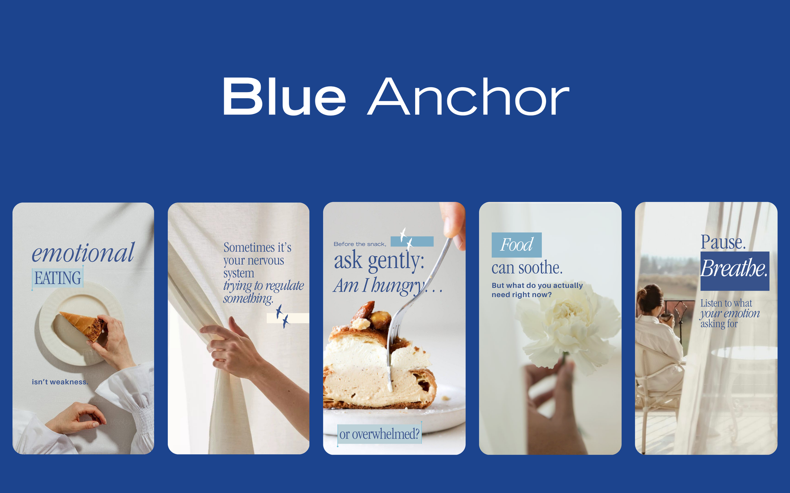
Editorial Slide Layouts
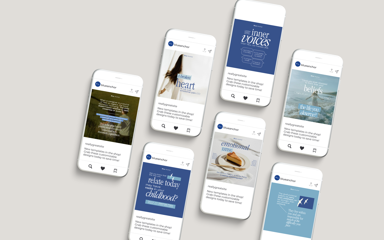
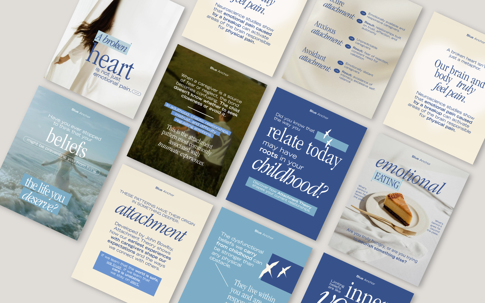
Versatile System


Blue Anchor Psychology was already doing something right: they were sharing valuable, evidence-based insights. But in the world of social media, good information isn't enough if the delivery feels clinical.
The existing feed was suffering from “cognitive clutter.” With heavy text blocks, high-contrast imagery, and no emotional rhythm, the content felt like a lecture. For a user already struggling with anxiety or overwhelm, the design wasn't a helping hand—it was a barrier.
The challenge was clear: How do we turn “information delivery” into “emotional support”?
Before touching a pixel, we had to understand the mindset of the audience. We identified the core persona as the Self-Aware Seeker—someone emotionally curious but easily overwhelmed. They aren't looking for loud motivation; they are looking for permission to pause.
We decided to move away from the clinical “expert-to-patient” dynamic. Instead, the visual strategy would mirror a calm internal dialogue. Every design choice needed to answer one question: Does this feel like a safe place to breathe?
The breakthrough concept for this rebrand was "Emotional Breathing Space." We realized that in a feed full of noise, the most powerful thing we could offer was silence (visual white space).
During the audit, we found that full-bleed photography felt too heavy, while pure illustration felt too distant. We needed a middle ground.
The final design system is built on predictability as a safety cue. When a user sees a Blue Anchor post, they immediately know how to navigate it.
The result is a feed that feels like a safe place to pause, rather than just another account to scroll past. The transformation shifted the brand perception from a medical provider to an emotional companion.
The qualitative feedback speaks to the power of design in mental health.
This feels like therapy between sessions.
By prioritizing emotional pacing over information density, we created a visual identity that doesn't just speak at the audience—it sits with them.
We use cookies to improve your experience on our site. By using our site, you consent to cookies.
Manage your cookie preferences below:
Essential cookies enable basic functions and are necessary for the proper function of the website.
These cookies are needed for adding comments on this website.
Statistics cookies collect information anonymously. This information helps us understand how visitors use our website.
Google Analytics is a powerful tool that tracks and analyzes website traffic for informed marketing decisions.
Service URL: policies.google.com (opens in a new window)
You can find more information in our Cookie Policy and Privacy Policy.