The “Calm Care” Social Media Rebrand
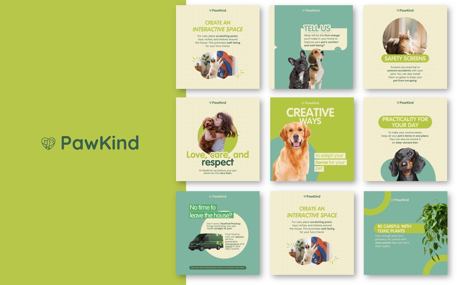
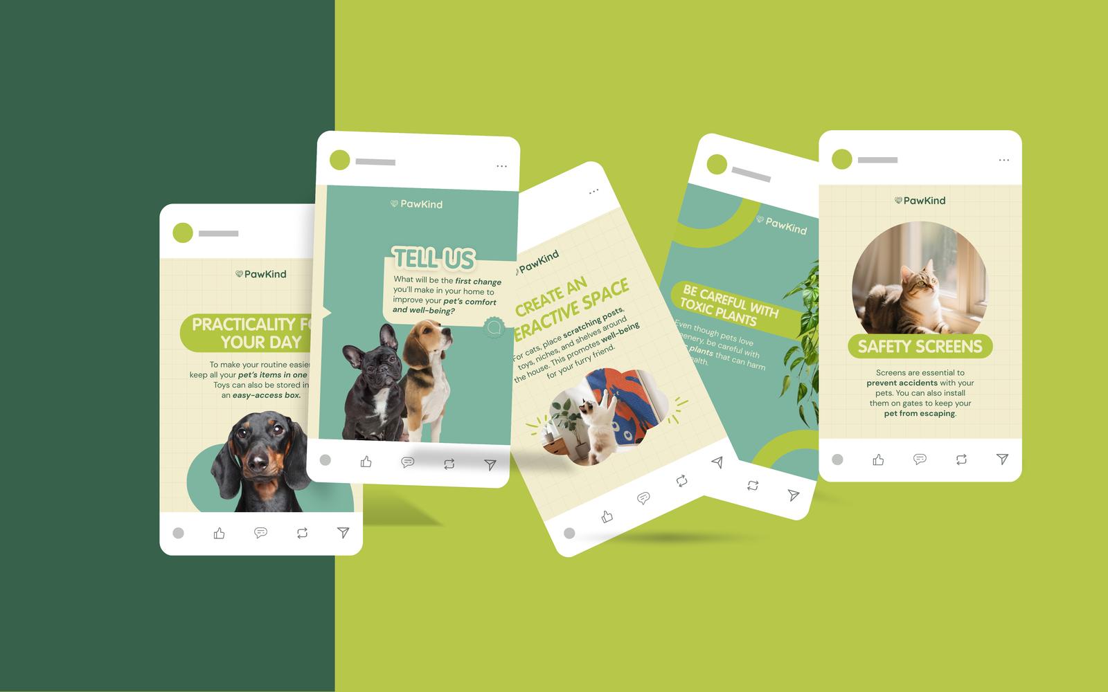
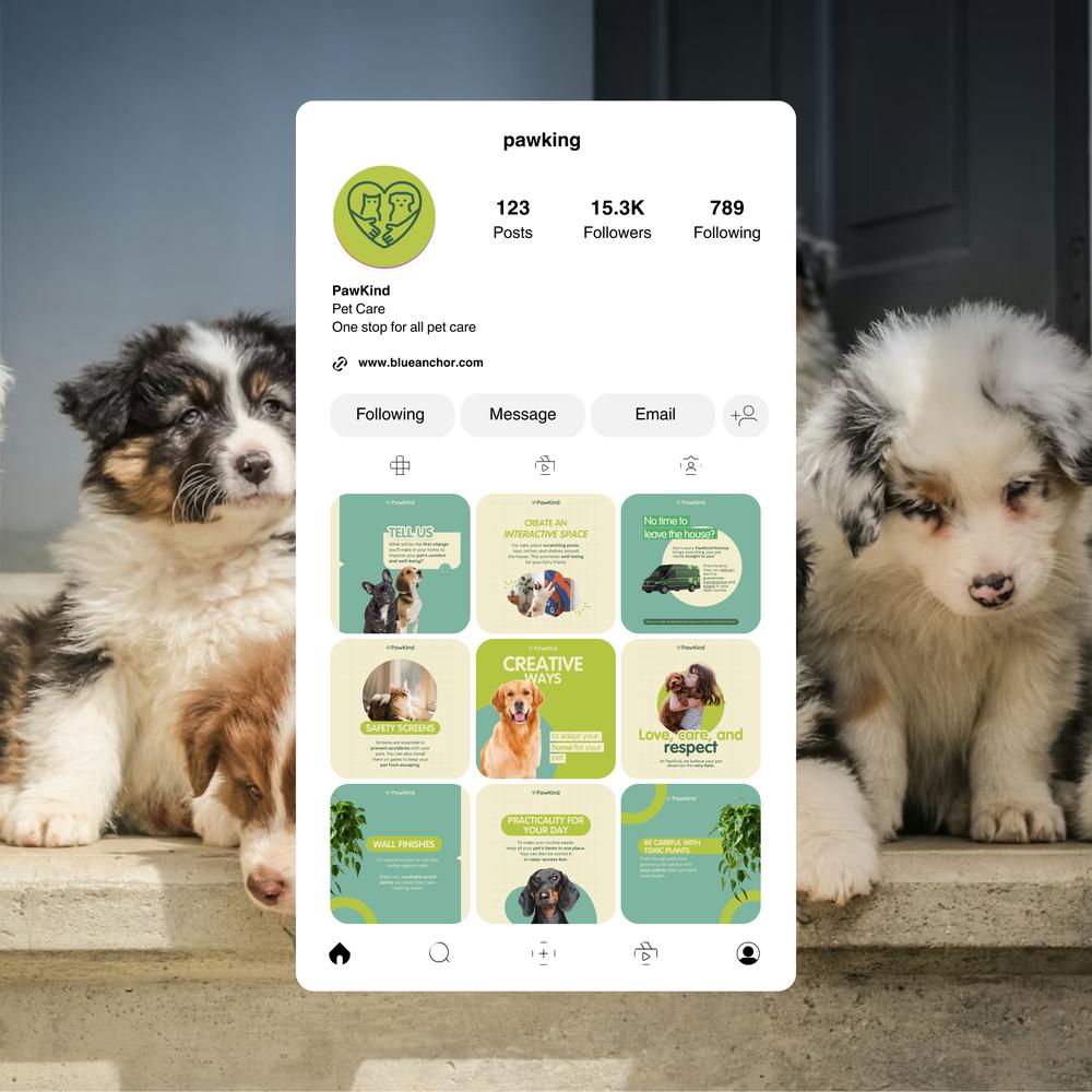
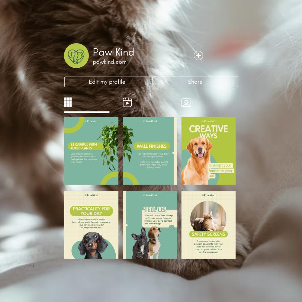
Cohesive Social Grid
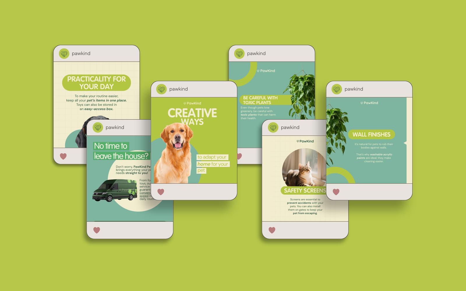
Varied Post Layouts
Branding Design System
Oval invitation suite

In the pet care industry, trust isn't a luxury—it’s a requirement. PawKind offered exceptional veterinary support and grooming services, but their digital presence told a different story. Their mandate was clear: Transform a warm but inconsistent brand into a calm, trustworthy social media authority.
PawKind had a credibility gap. While their actual services were reliable and professional, their social media feed was visually chaotic, text-heavy, and lacked a recognizable identity.
Pet parents were scrolling right past them. While competitors were leveraging high-emotion content, PawKind’s feed felt strictly informational and clinical. They needed to stop the scroll not by shouting louder, but by whispering reassurance.
We moved beyond the generic demographic of "Pet owners, 25–45" and targeted a specific psychographic mindset: The Anxious Caregiver.
These owners deeply love their pets but are driven by the fear of doing the “wrong thing.” They aren't looking for loud advertisements; they are seeking a safe harbor. They want a brand that feels knowledgeable, kind, and protective.
To calm this anxiety, we realized the visual language had to abandon the “loud and chaotic” trends of the pet industry. PawKind needed to look like a calm expert, providing gentle guidance rather than information overload.
During the audit phase, we noticed that most pet brands rely on high-saturation colors and cluttered layouts. This creates "visual noise"—the exact opposite of what an anxious pet owner needs.
We explored a playful, bold route, but quickly rejected it. While fun, it felt better suited for a toy brand than a healthcare provider. Instead, we anchored the system around the concept of “Calm Care.”
The new PawKind identity is built on three pillars designed to lower cognitive load
We selected soft greens to communicate balance and health, paired with warm beiges and muted neutrals. The typography is a clean, rounded sans-serif, ensuring that even dense veterinary advice is legible and friendly on small mobile screens.
A design system is only as good as its application. We developed a content mix that blends seamless promotion with genuine value
The result is a feed that feels cohesive and instantly recognizable. It avoids mechanical repetition by using a flexible grid that keeps the user interested.
PawKind has transformed from "just another pet page" into a trusted digital companion.
The new visual identity has bridged the gap between their service quality and their public perception. Educational posts are seeing higher save rates, and the feedback loop has shifted from transactional to emotional.
We finally feel proud of our social media. Our feed now reflects the care we actually provide—calm, loving, and professional.
We use cookies to improve your experience on our site. By using our site, you consent to cookies.
Manage your cookie preferences below:
Essential cookies enable basic functions and are necessary for the proper function of the website.
These cookies are needed for adding comments on this website.
Statistics cookies collect information anonymously. This information helps us understand how visitors use our website.
Google Analytics is a powerful tool that tracks and analyzes website traffic for informed marketing decisions.
Service URL: policies.google.com (opens in a new window)
You can find more information in our Cookie Policy and Privacy Policy.